Every Peakboard developer has lived through this scene. We build a clean KPI tile, polish the typography, get the border radius just right, then copy and paste it onto four more screens. A week later somebody asks for a 2px tighter shadow, and we are back in the Designer at midnight, hunting down all the copies one by one. Software engineers have had a name for this anti-pattern for thirty years - DRY, “Don’t Repeat Yourself” - and the Peakboard answer is Custom Components: one master, many instances, one place to edit. Let’s build one.
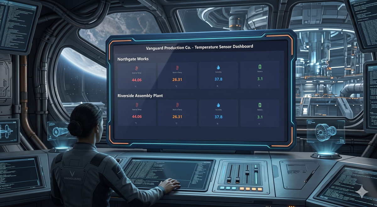
For the example we reuse the data backend from our LoRaWAN article - a Dragino LHT65SE3 sensor pushing temperature and humidity readings into Peakboard via The Things Network and MQTT. The finished Peakboard project is attached as a download (MyReuseableComponents.pbmx), so we can open it in the Designer and follow along, or jump ahead and reverse-engineer it.
Building our own component
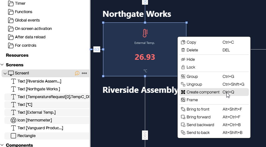
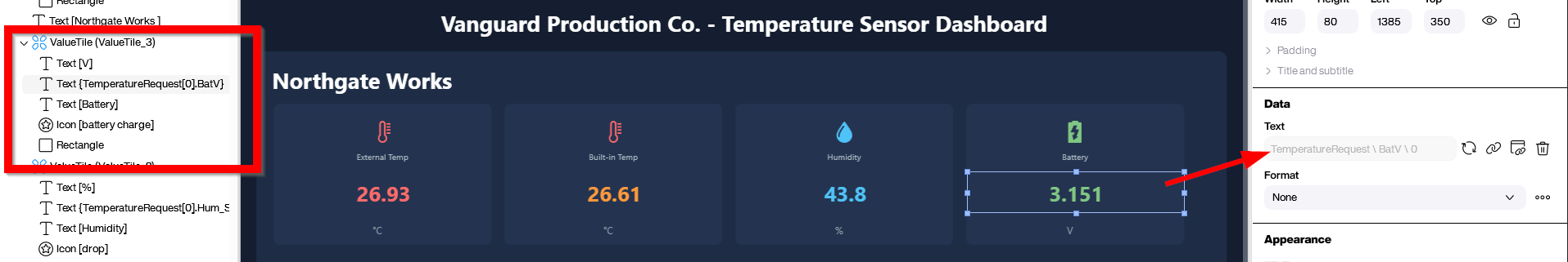
In our example we build a small KPI tile component. It holds five controls: an icon, a caption, the value itself, a unit field, and a rectangle sitting behind everything else as the background. With all five selected, a right-click opens the context menu with the Create component entry.
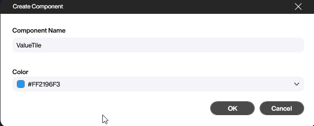
So far it behaves like a normal group of controls. The difference shows up after we give the component a name in the dialog that follows.
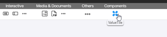
From that moment the component lives in the control pane on the left, ready to be dropped onto any screen in the project like any built-in control.
Using the component
Once the component exists, we drag and drop it onto a screen like any other control. It lands as a complete copy of the master and behaves, at first glance, like a normal group of controls. The interesting part is that we can still pick individual controls inside an instance and override their properties locally. In our example we click into the value control of one tile and rebind it to a different sensor reading, and we do the same for the icon, the caption, the colours, and anything else that should differ from the master.
Any property we explicitly touch on an instance becomes a local override and stays the way we set it. Everything we leave alone continues to follow the master. The payoff lands the moment we go back and edit the master: every slave inherits the change automatically, except for the properties we have already overridden. Local edits stick; the rest stays in sync.
A second example: the header menu
For a second example we build a typical header menu - a navigation strip that should look identical on every screen of the project, except for a small visual hint of which page we are currently on. The full project is attached as ReuseableMenuComponent.pbmx. On the overview screen we lay out the menu row and turn the whole thing into a component.
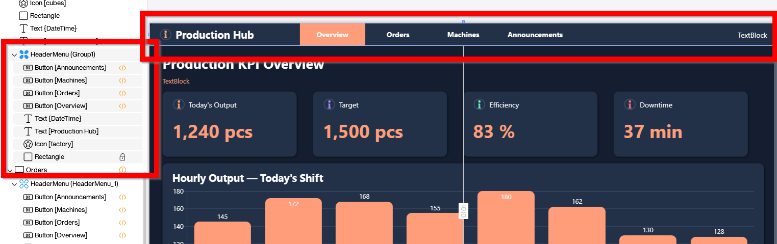
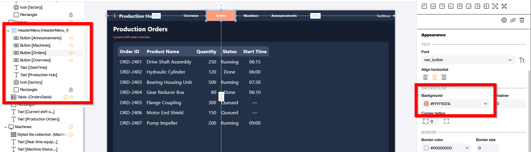
On every other screen we drop the same component in place. The layout, fonts and base colours are inherited from the master and stay in lockstep automatically. The one thing each screen needs to differ on is the active page indicator. On the orders screen we override the colour of the Order entry to orange so the operator can see at a glance which page they are looking at. The override is local; the master keeps its original colour, and every screen that has not been overridden stays in sync.
Conclusion
Custom Components take the most repetitive part of UI work - keeping a dozen screens visually consistent - and turn it into a one-time problem. We design the master, drop instances where we need them, and let local overrides handle the small differences that always crop up. Six months later, when a brand colour changes or a corner radius gets revisited, we edit the master and every screen updates at once. Which is, of course, exactly the point of not repeating ourselves.