Building a Peakboard application is easy and straightforward. But usually, as the scope increases, people from different parts of the company start getting involved—different departments and geographical locations. In this case, there are some best practices and patterns for enterprise to consider.
In this article, we’ll discuss how to build an enterprise-wide Peakboard template that enforces corporate design requirements, and ensures that even non-design and non-marketing people can build dashboards and applications that comply with corporate requirements. These steps have turned out to be best practices for hundreds of customer projects.
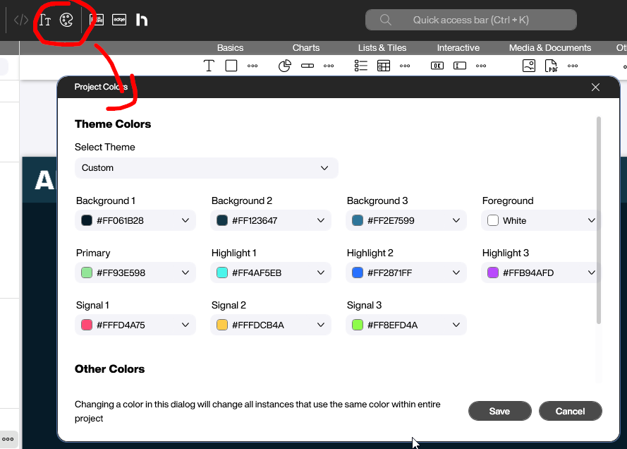
Colors
Project Colors stores the colors used in the current application. Each new control relies on this color set. The background colors determine the overall look—whether it’s a light or dark theme. The primary, highlight, and signal colors affect everything else, are they’re typically taken from the corporate design requirements.
Fonts
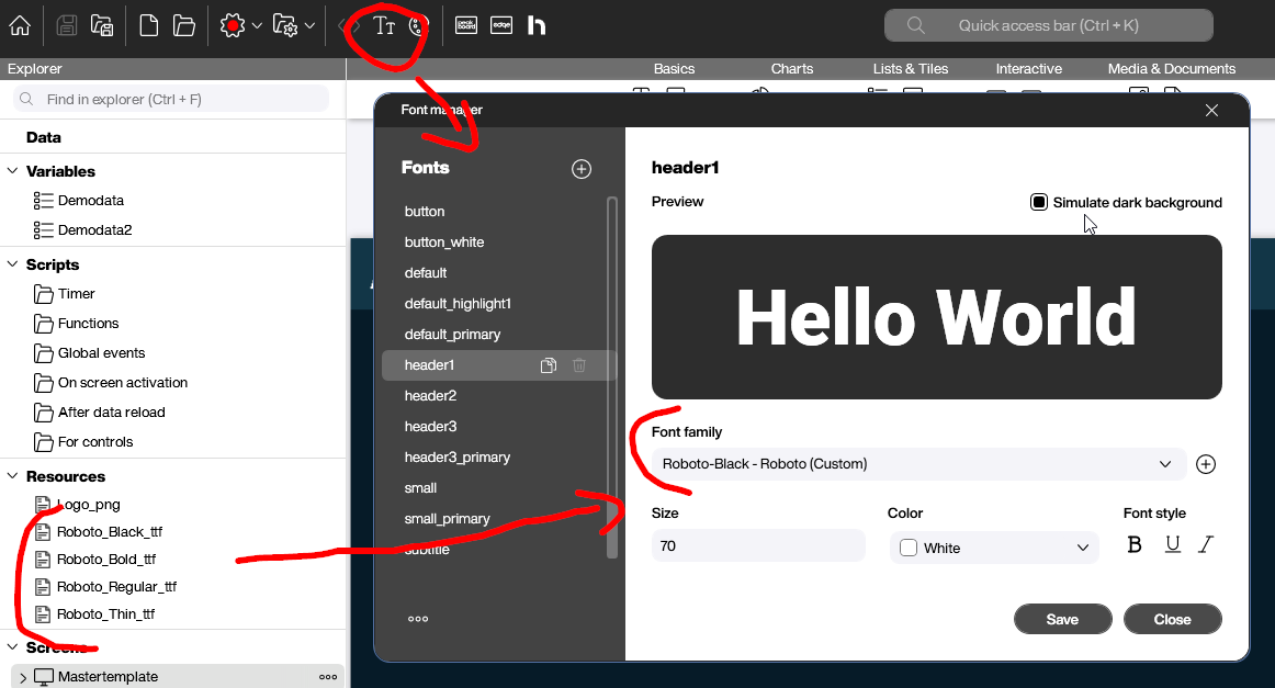
Corporate design guidelines usually specify one or two fonts to use. All font-related definitions for different font styles (like header, button, and default) can be defined in the corresponding dialog.
But what if your company’s font is not available by default in Peakboard? In that case, you have to add a custom font to the project, as a resource (TTF file). That way, the TTF file is deployed as part of the project to the Peakboard Box.
Building the Master Screen
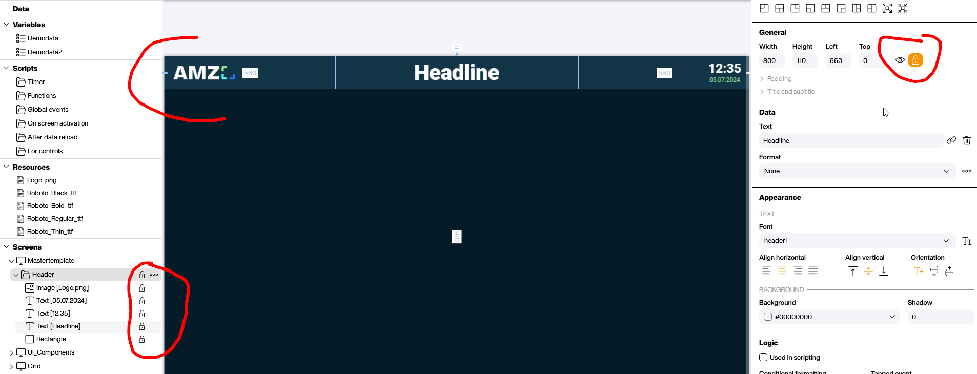
To set one or more master screens, we first add the company’s logo as a resource, and then build the actual template. Usually, a header with the logo, and a text box with the current time and a headline, is a good start.
After placing these items, we group them and then lock them by clicking on the lock icon. That way, they won’t be changed accidentally.
When we want to create a new screen, we right click on the template screen and then select Duplicate (only locked controls). The new screen will only have the locked template controls on it.
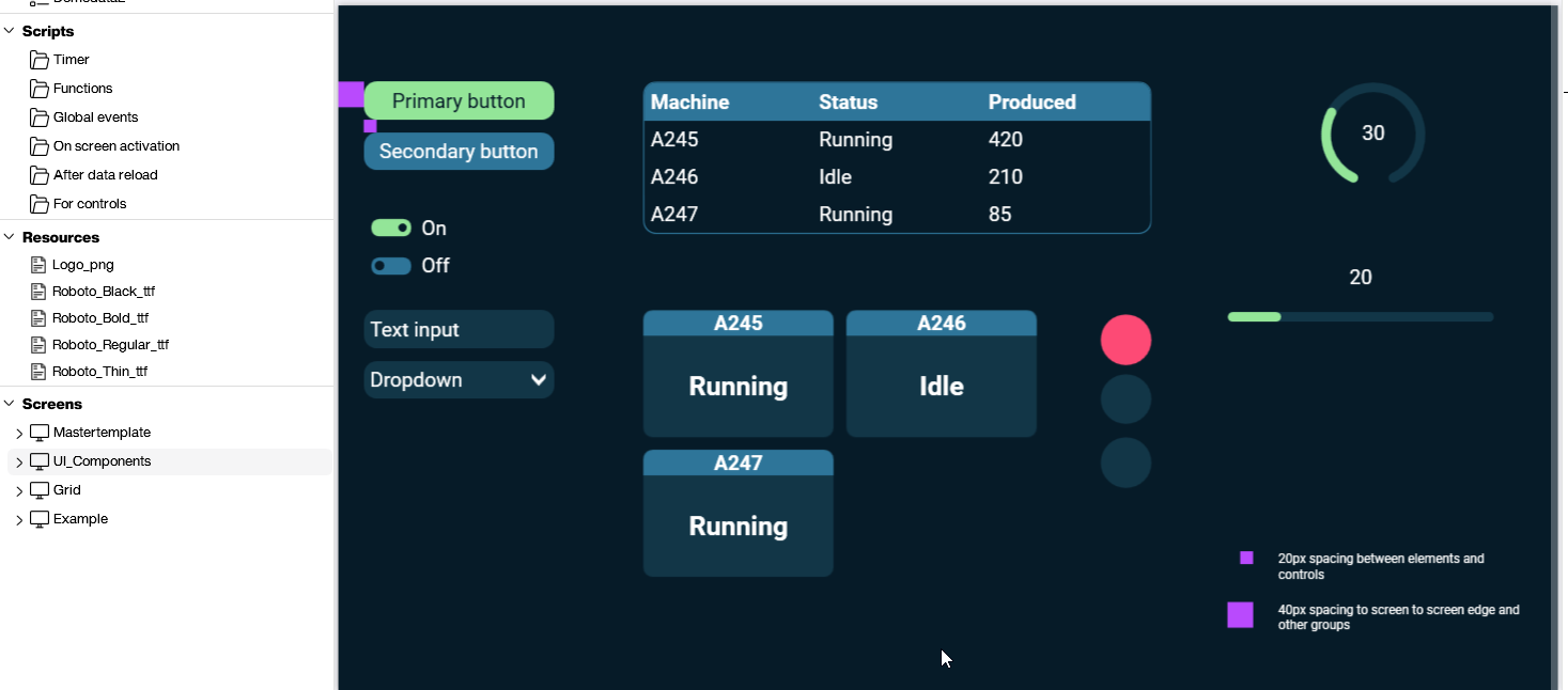
UI Components
UI components are mainly defined through the default colors and default fonts, which we’ve already covered. For further customization, we can build UI control templates on a separate screen, as shown in the following screenshot.
Then, the user can pick a UI control from the template, and copy and paste it onto the screen they’re working on. The copied control will have all the necessary styles, and can be used right away.
The template also provides a guide on proper spacing. It shows a spacing of 20px and 40px, and explains when to use each. Of course, you can add more explanatory text and hints if necessary.
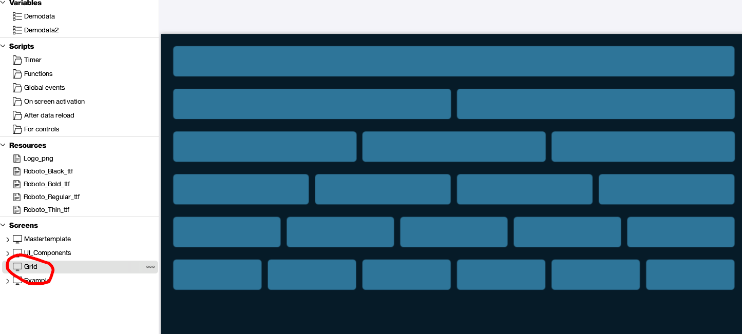
Grid
An often-used pattern is to group controls into dedicated areas. The following screenshot shows how to prepare these grid areas. We can copy and paste the grid onto a new screen, adjust its height, and then use it right away.
This kind of grid makes the end result look more professional, and also gives the end user of the board a sense of which controls belong together, making the whole board easier to use.
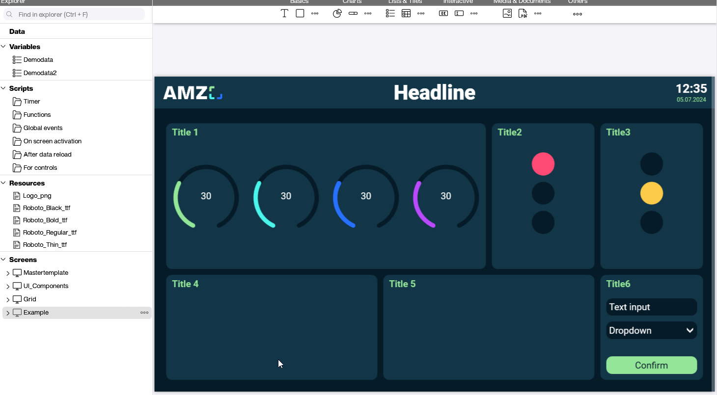
Final Result
The following screenshot shows a screen that uses all the techniques we’ve discussed. We use predefined colors and fonts, along with the master template and its header. The UI controls are copied from the template screen and placed on a predefined grid.