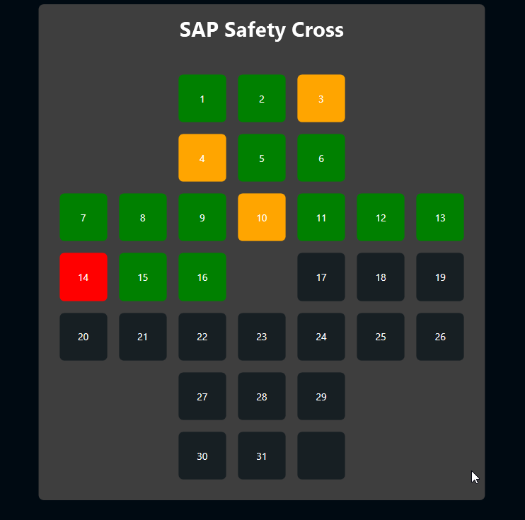
A safety cross is one of the most common methods for visualizing safety in lean manufacturing.
The cross typically consists of 31 rectangles, which represent the 31 days in a month. Each day, the corresponding rectangle is colored in, according to what happened:
- Green - No accident
- Orange - Light accident
- Red - Severe accident
So ideally, at the end of the month, the whole cross should be green. That’s what managers want to see.
Typically, the cross is colored manually. But of course, we can do better. In this article, we discuss how to fill a digital safety cross automatically, with data taken from the SAP HR module. And there’s absolutely no changes or additions necessary in SAP. Anyone can download the demo PBMX, put in their credentials, and start right away. It’s an out-of-the-box solution with literally any SAP system.
The SAP side
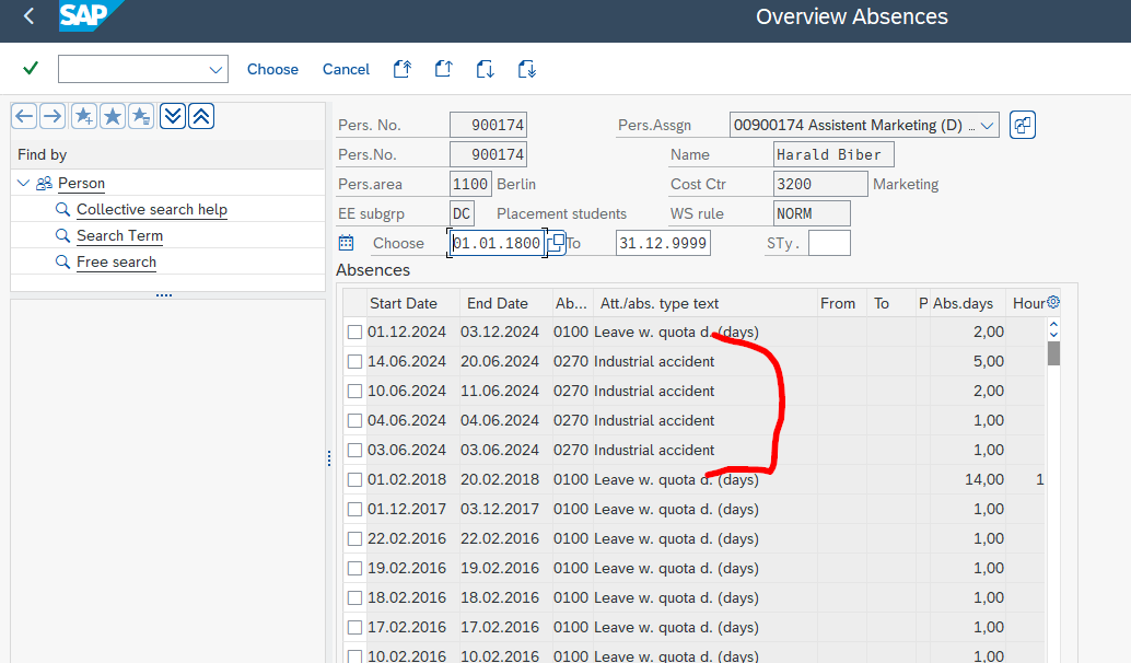
The basic idea is that every accident that happens in production causes an absence record in SAP HR. If the employee is absent for one or two days, then it’s a minor accident. If the employee is absent for three or more days, then it’s a severe accident.
HR data in SAP is organized into “info types.” These info types have numbers. The info type we’re looking for has the number 2001. We also need a filter for the subtype. In our case, the subtype is 0270, which stands for industrial accidents.
The following screenshot shows a list of absence records in transaction PA30. Besides regular vacation days, there are four accident records. (Keep in mind that this is just sample data. If a single employee has four accidents in two weeks, then something is wrong with the company!)
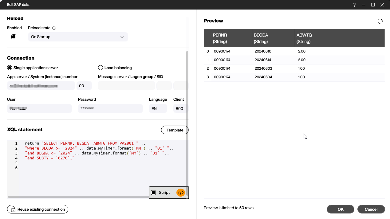
The table where info types are stored is named PAXXXX, where XXXX is the type number. So, we use the table PA2001, with SUBTY = 0270 for the subtype. We also use the date field BEDGA to limit the data to the current month. This gives us the raw data for our safety cross.
Set up the data source
In Peakboard Designer, we first set up a time data source, because we’ll need to determine the current month later.
We also need an SAP data source. Here’s the XQL to select the data:
ELECT PERNR, BEGDA, ABWTG FROM PA2001
where BEGDA >= '20240601' and BEGDA <= '20240631'
and SUBTY = '0270';
We also need to make it dynamic. The month value within the two date values should always be the current month. So, we enrich the XQL code with a bit of LUA to determine the current month:
return "SELECT PERNR, BEGDA, ABWTG FROM PA2001 " ..
"where BEGDA >= '2024" .. data.MyTimer.format('MM') .. "01' "..
"and BEGDA <= '2024" .. data.MyTimer.format('MM') .. "31' "..
"and SUBTY = '0270';"
And here’s what the data source dialog looks like. In the preview grid on the right, you can see the raw data that matches the data we saw in transaction PA30 above.
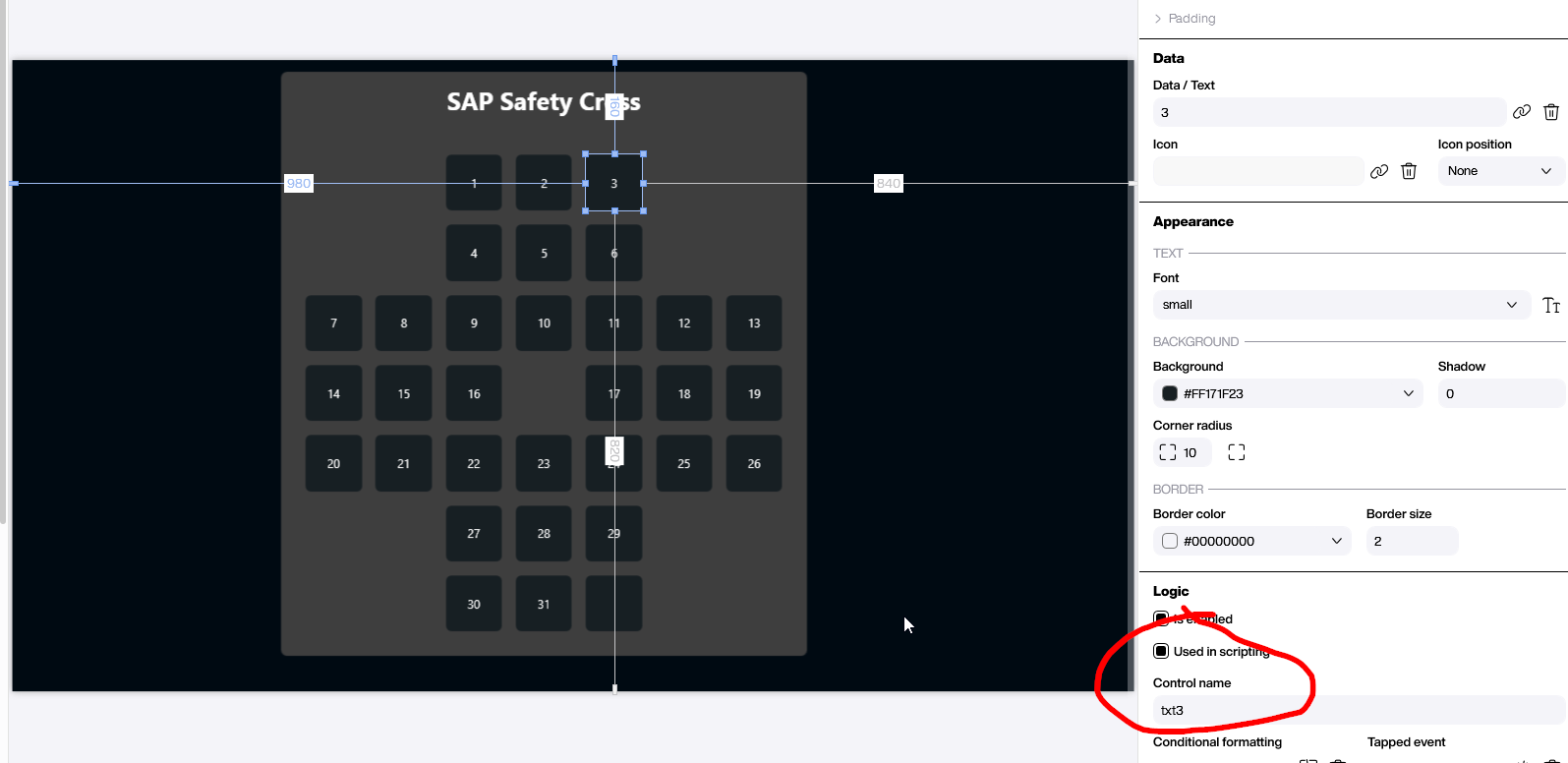
Build the cross
On the canvas of our project, we add a bunch of text fields to form a cross. We name the text boxes according to the day they represent, so we can easily refer to them later in the script.
Create the script
The reload script of the SAP data source is the magic that turns the raw data into colored text fields. The script is simple and can be easily done with Building Blocks. However, we’ll use LUA in this article because we need to treat each day individually, and LUA lets us do this in a more condensed way.
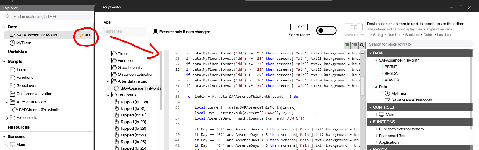
First, we check each day and see if it’s today or anytime before today. If it is, then we set the text field to green. If not, we leave it on the default neutral color. In the following script, only day 1 and day 31 are shown. The rest are omitted to make the code more clear.
if data.MyTimer.format('dd') >= '01' then screens['Main'].txt1.background = brushes.green end
[.....]
if data.MyTimer.format('dd') >= '31' then screens['Main'].txt31.background = brushes.green end
In the next block, we loop over the entire SAP data set. We convert the SAP data value to the current day by using this:
string.sub(current['BEGDA'], 7, 9)We turn the number of absence days from string to a number with this:
AbsenceDays = math.tonumber(current['ABWTG'])Then, we check every entry and day. If the number of absence days indicate a severe or minor accident, we set the text field color accordingly.
for index = 0, data.SAPAbsenceThisMonth.count - 1 do

	local current = data.SAPAbsenceThisMonth[index]
	local Day = string.sub(current['BEGDA'], 7, 9)
	local AbsenceDays = math.tonumber(current['ABWTG'])

	if Day == '01' and AbsenceDays < 3 then screens['Main'].txt1.background = brushes.orange end
	[.....]
	if Day == '31' and AbsenceDays < 3 then screens['Main'].txt31.background = brushes.orange end

	if Day == '01' and AbsenceDays >= 3 then screens['Main'].txt1.background = brushes.red end
	[.....]
	if Day == '31' and AbsenceDays >= 3 then screens['Main'].txt31.background = brushes.red end

end
Result and conclusion
The following screenshot shows the final result according to our sample data from earlier. All the colors are set according to the logic of minor and severe accidents.
The LUA script is really simple and can be easily modified. It would be easy to adjust the XQL to limit the data to certain teams or use other info types.