Last week we pulled an Office 365 group calendar into Peakboard and watched its entries land in the Designer’s preview pane as five neat columns: Subject, Start, End, Body and Location. Five neat columns are perfect for a styled list or a KPI tile, but a calendar is fundamentally a matrix - days running one way, hours the other, events laid out as blocks at the intersection. Peakboard ships a dedicated Calendar control that draws exactly that grid, and in this article we point it at the data source we built last week and turn those rows back into something that actually looks like a calendar.
Pointing the control at the data
The Calendar control sits in the toolbox like any other Peakboard control. Drop it onto the screen, drag it to the size we want, and the only work left is to tell it where the events live. The Data section of the property panel handles all of that. We point the Data source field at MyFactoryEvents - the Office 365 calendar data source we set up in the previous article - and then map the three columns the control needs in order to draw an event block: an Event column that holds the title rendered inside the block, a Start time column and an End time column. Those three are the minimum a calendar entry needs - what it is, when it starts, when it ends - and they line up almost one-to-one with the columns we already have from Office 365: Subject, Start, End. The final field, Data format, tells the control how to parse the date strings; our Office 365 data source returns timestamps as HH:mm:ss dd.MM.yyyy, which is exactly what we paste in.
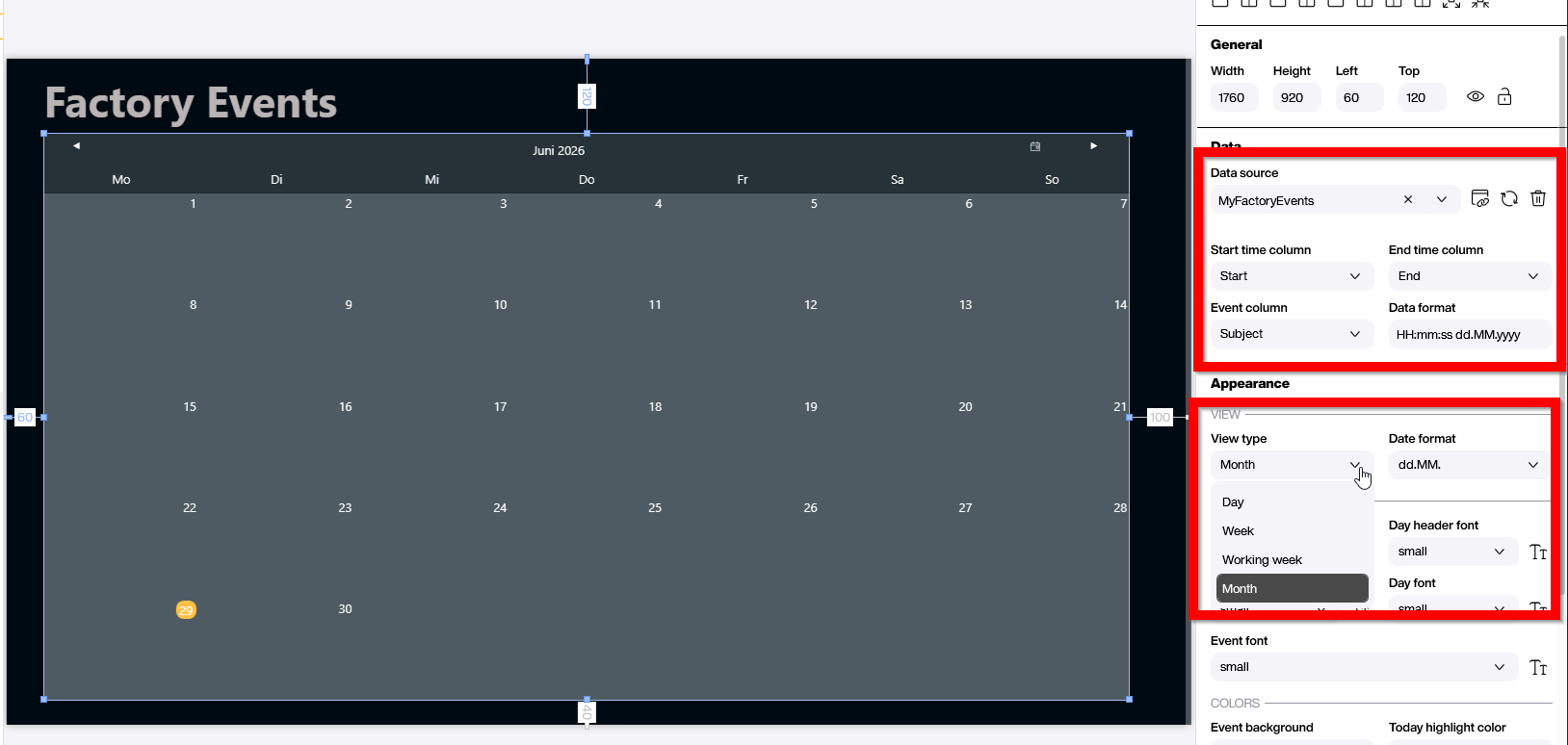
A bit further down, the Appearance section lets us pick the View type - Day, Week, Working week, Month or Year. For a shop-floor schedule that spans audits and maintenance windows weeks in advance, Month is usually the right default; for a daily standup screen, Day or Working week reads better. We can always wire a button or a parameter to flip between views later. The rest of the Appearance section (date format, day-header font, day font, colours) is the usual styling housekeeping - pick what reads well at the distance the screen will live at.
Week view vs month view
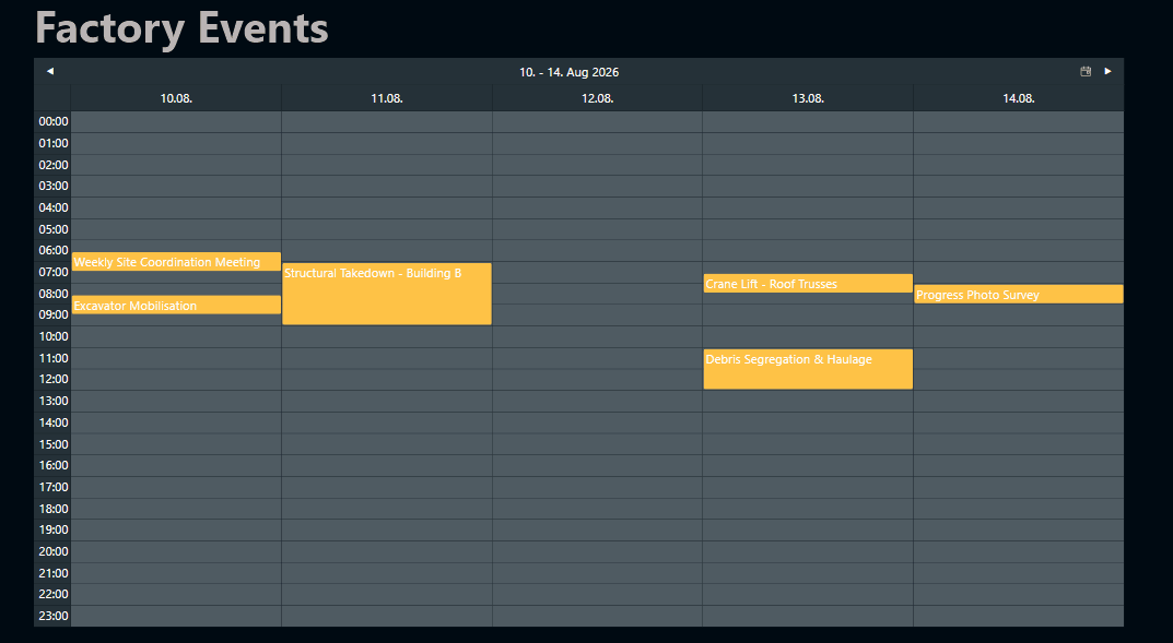
Flipping the View type from Month to Working week turns the empty grid we saw inside the Designer into something the operator can actually plan a day around. Where the month view treats each day as a single cell with at most an event title or two squeezed inside, the week view gives each day a full column of hours and renders every event as a coloured block placed at its actual start time, sized to its duration.
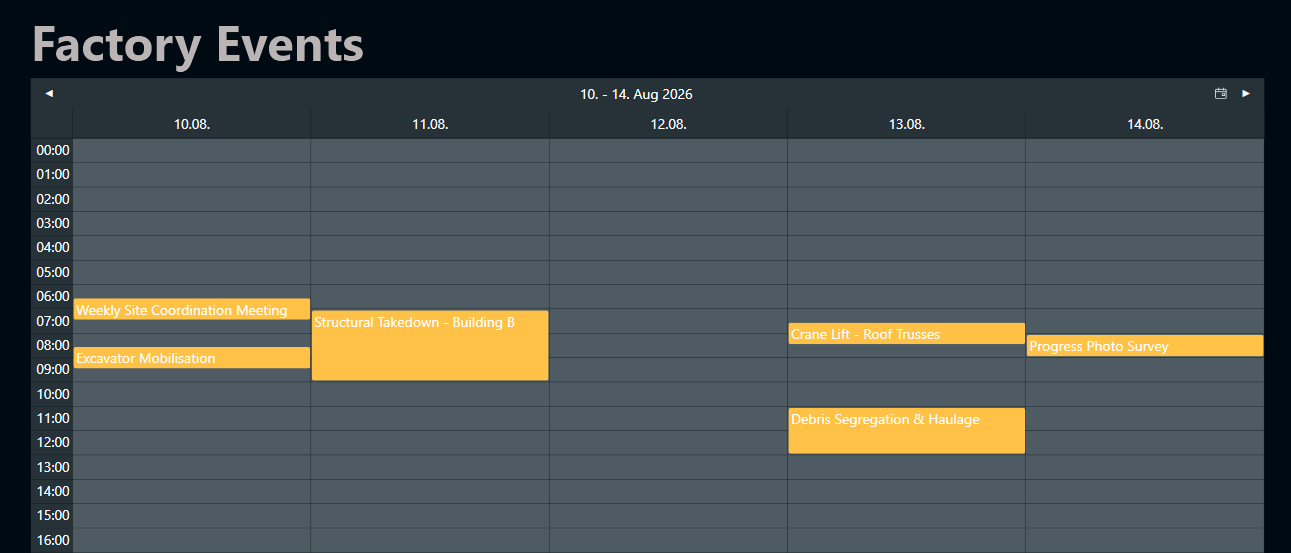
Suddenly the schedule reads more like the wall planner the foreman used to keep next to the kettle. We can see at a glance that Tuesday is the busy demolition slot, Thursday morning has both a crane lift and a debris haul stacked side by side, and Friday is almost open. The two views are good at different things and they share the same data source: the month view is the right pick for the supervisor screen that needs a four-week horizon at a glance, while the working week view is what we put up next to the crew that actually has to live through the next five days.
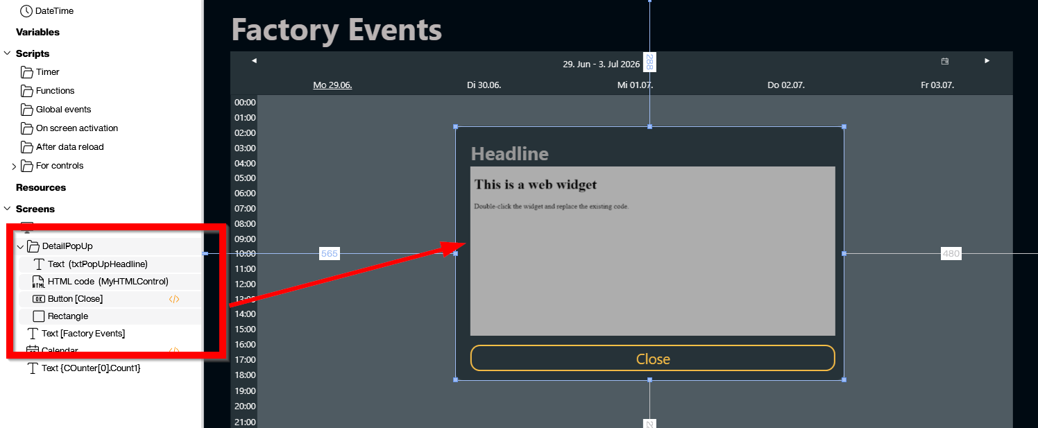
A pop-up for the details
The blocks on the grid carry the title and the time, which is fine for an at-a-glance view but rarely the whole story. Most of the time the operator wants to know more: who organised it, where it is, what the briefing actually says. We can wire that up with a small custom pop-up dialog that opens when an event is clicked. The general recipe is the one we walked through in Peakboard UI Hacks - Next-Level Custom Dialogs: group the dialog’s controls together in the Explorer, keep them invisible at design time, and flip their visibility from a Lua script when the dialog needs to come up.
The group we add this time lives under a folder named DetailPopUp and holds four controls: a rectangle as the background, a Text control for the headline (txtPopUpHeadline), an HTML Code control (MyHTMLControl) where the body of the event is rendered, and a Close button that hides the whole thing again.
The HTML Code control is the small piece of magic here. The Body column from the Office 365 data source comes back as a chunk of HTML - the same markup Outlook would render in its own preview pane - so we feed it straight into MyHTMLControl without any reformatting. Bold, bullet lists, inline images, hyperlinks, the lot.
Wiring the tap
The pop-up does not appear by itself; it appears because the Calendar control has an Event tapped property that fires whenever one of the coloured blocks is tapped or clicked, and we hang a short script off that event. The script is three blocks long, courtesy of the Designer’s block-based editor - no Lua required.
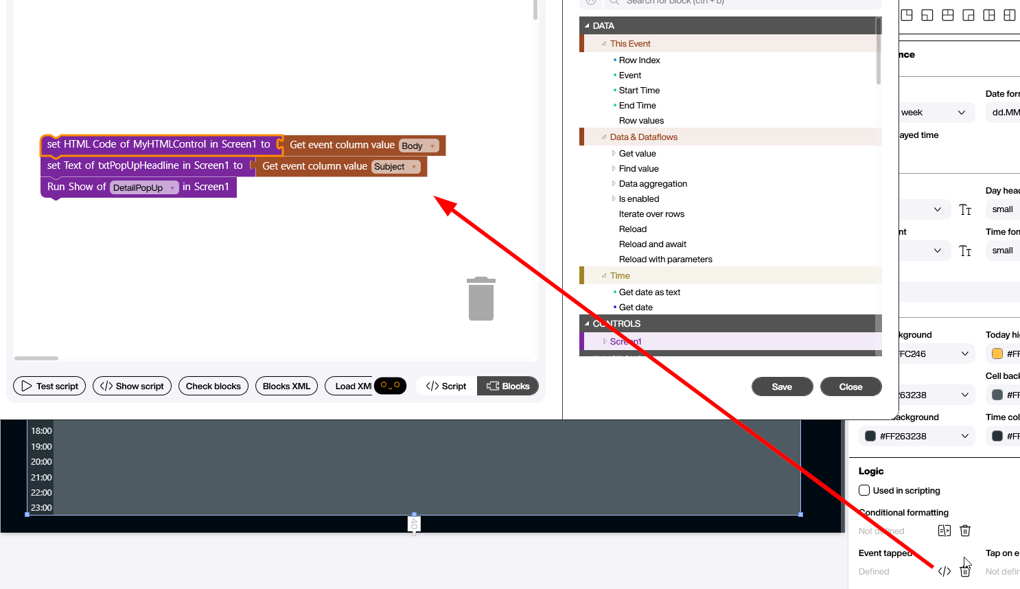
The first block grabs the Body column of the tapped event with the Get event column value helper and pushes it into the HTML Code property of MyHTMLControl. The second does the same with Subject and lands it in txtPopUpHeadline. The third runs Show on the DetailPopUp folder, which flips the whole group from invisible to visible in one go. Tap an event on the calendar and the dialog pops up over it with the briefing text rendered exactly as it would look in Outlook. The operator sees the full meeting body without ever leaving the screen, and we never had to touch the Office 365 API ourselves.
Conclusion
Two articles, one screen: the data source feeds the rows in, the Calendar control turns them into a matrix, and a three-block tap handler opens a rich-HTML pop-up with the full briefing on demand. Click an event, get the briefing - exactly what bringing the schedule to the shop floor was supposed to look like.