Climate change and global warming are real, and anyone who digs into the numbers and facts is often shocked by how clear and obvious it is. We will discuss this in today’s article. We will also learn a nice approach for processing JSON data that seems almost unmanageable at first.
The data we will use comes from a website called Climate Reanalyzer, which is run by the University of Maine. It makes raw weather data—especially historic climate data—available to the public. Here, you can find some information about the daily surface temperature in the Northern Hemisphere, since 1940.
The data
The actual data we want is available at this URL:
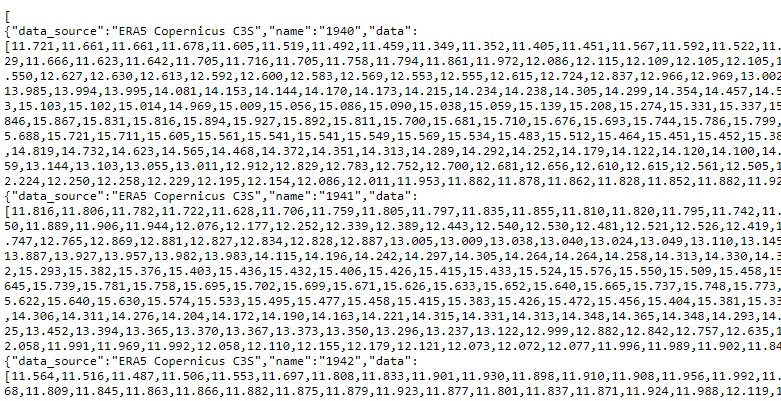
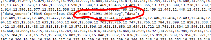
https://climatereanalyzer.org/clim/t2_daily/json/era5_world_t2_day.jsonThe data is a JSON array, where each object in the array contains the temperature data for a particular year or range of years. Each object has the following fields:
data_source: the source for the temperature data.name: the year or years of the temperature data. Some objects contain the average weather data over multiple years. In this case,namewill look something like1979-2000 avg.data: an array that contains the temperature for each day. The index of the element corresponds to the day of the year. So the zeroth element is the temperature for the first day of the year (January 1), and the 364th element is the temperature for the last day of the year (December 31)—assuming it’s not a leap year.
The following is what the first element of the array looks like. This object contains the temperature data for 1940 (the screenshot only shows up to day four).
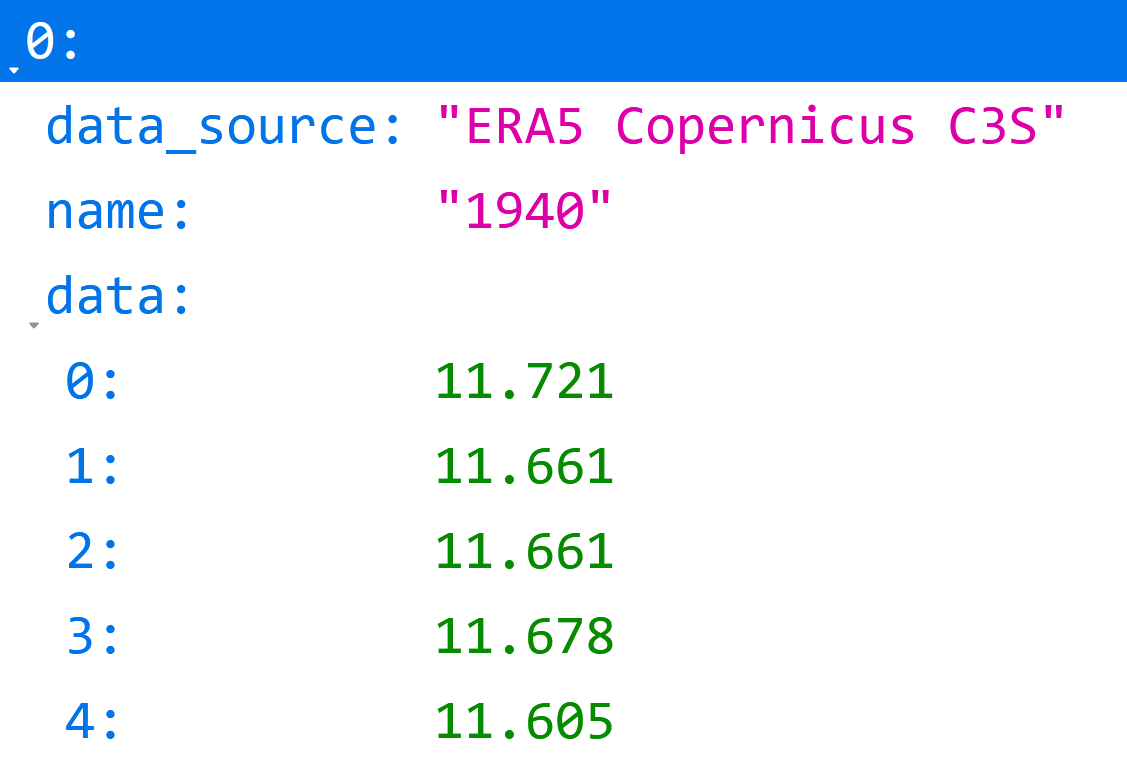
And here’s the raw data:
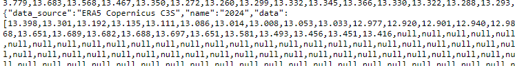
It’s worth mentioning that the data array for the current year (2024) still has 365 entries, but the days in the future are null:
Here’s an object that contains the average weather data between 1990 and 2020:
Build the data source
Now, let’s go into Peakboard and build a JSON data source that takes in the weather data from Climate Reanalyzer.
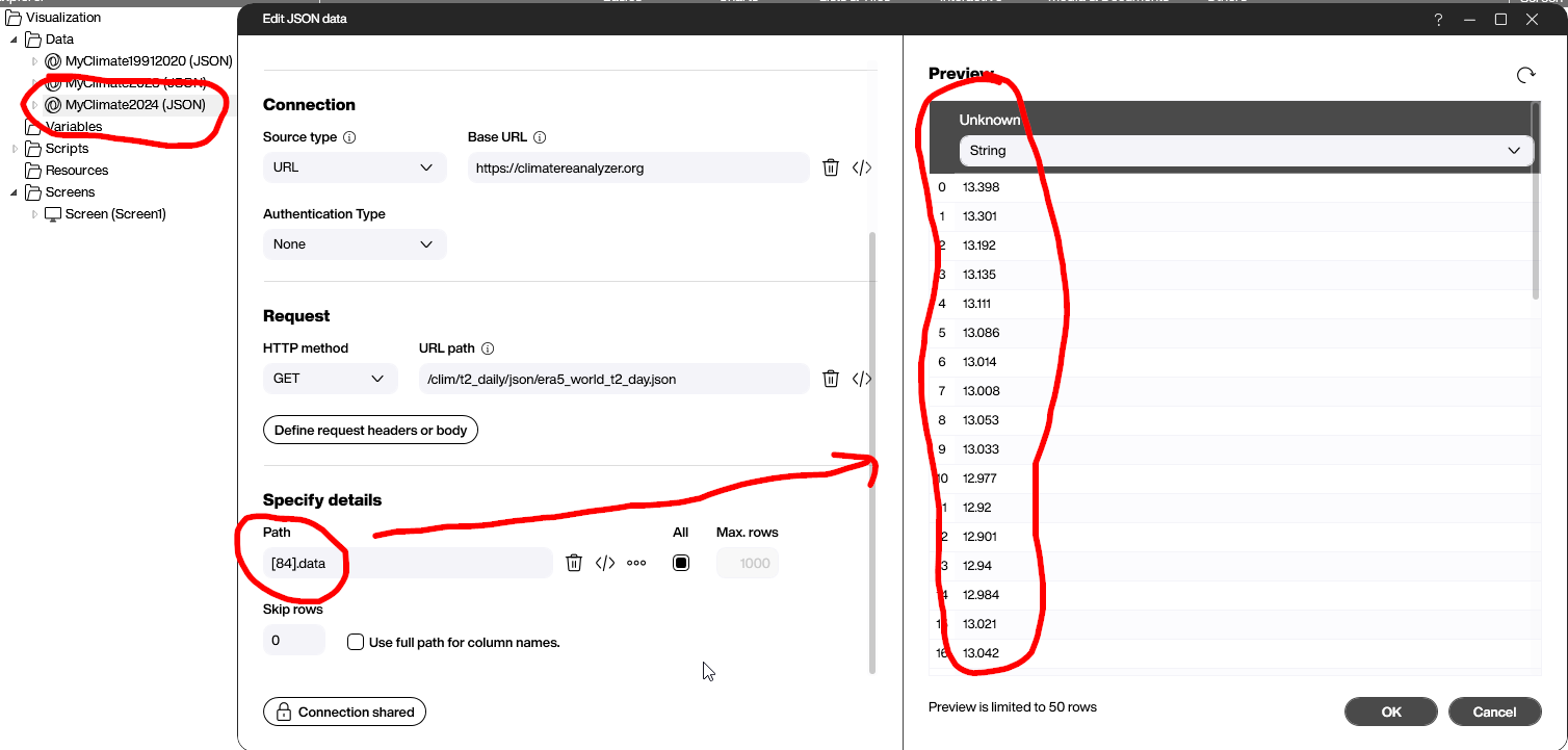
To choose the year of the data, we set the path to point to the element in the array that we want. Let’s set this first data source to 2024.
Because each year is one array entry, and the data starts in 1940 at index 0, the year 2024 is at index 84. So, we set the path to point to the data field of the object at index 84.
You can also use the button with the 3 dots to have Peakboard Designer show a hierarchical outline of the data. Sometimes, it can be tricky to find the right path.
The actual output is the temperature array.
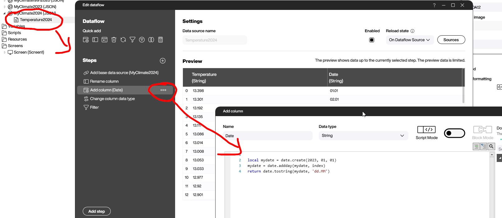
To use the data in a chart, we need to beautify it a bit by using a data flow.
First, we give the unknown column a better name: Temperature.
Next, we add a column for the actual data. There’s a small Lua script behind the column generation. To calculate the date, it takes January 1, 2023 and adds the index of the row. It returns only the day and month. The year is already determined by the data source itself.
Next, we turn the data type of the temperature into a number.
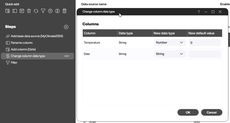
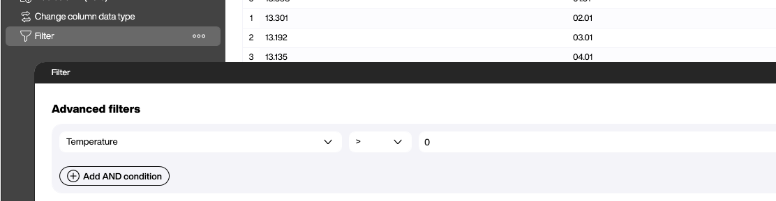
We also filter out the 0 values. We don’t need them anymore.
Building the chart
We add three data sources:
- One for the average of the years 1990-2020.
- One for 2023.
- One for 2024.
The data flows are always the same. The only thing that changes is the path of the JSON data source.
To visualize the data, we use a line chart with three series. Each of them point to a different data source. If the data was prepared well, binding the chart to the data is straightforward.
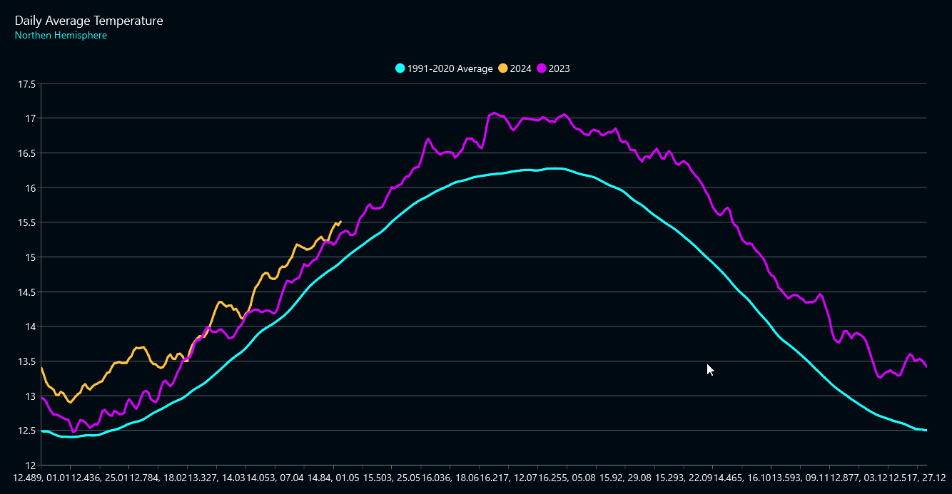
Result and conclusion
The following screenshot shows the result of the project we built. We learned two main points:
- Even if the initial JSON looks messy, it’s easy to get the data into a shape where it can be easily handled. Even if it’s tempting to bind the raw data directly to a chart, it’s important to clean it first: give the column proper names, turn the values into proper data types, etc. All that work pays off in the end.
- Climate change and global warming are real. Everyone is encouraged to download the PBMX and play around with the data. The way the surface temperature is changing is so obvious and clear that there should be no discussions. Climate Reanalyzer offers a wide variety of other data to play around with.