
Table controls are the most commonly used controls for displaying table data. However, we often see that designers do not use them to their full potential.
Table controls can be customized to make it as easy as possible for end users to find the information they’re looking for. This article covers the best practices for modifying a table row on the fly and adjusting its contents.
In our example, we use a list of outbound deliveries. Here’s how we want to modify the data in the table:
-
When the
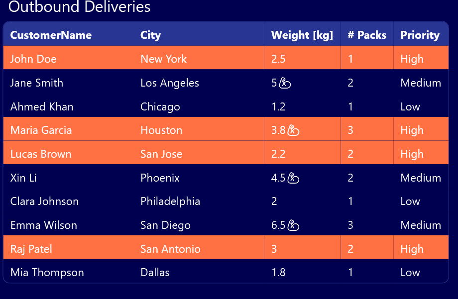
Prioritycolumn of an outbound delivery is set toHigh, the row should have a red background color. -
When the weight of a delivery is more than 3 kg, there should be a biceps icon next to the weight, to advise the end user that this delivery is especially heavy.
Preparing the data
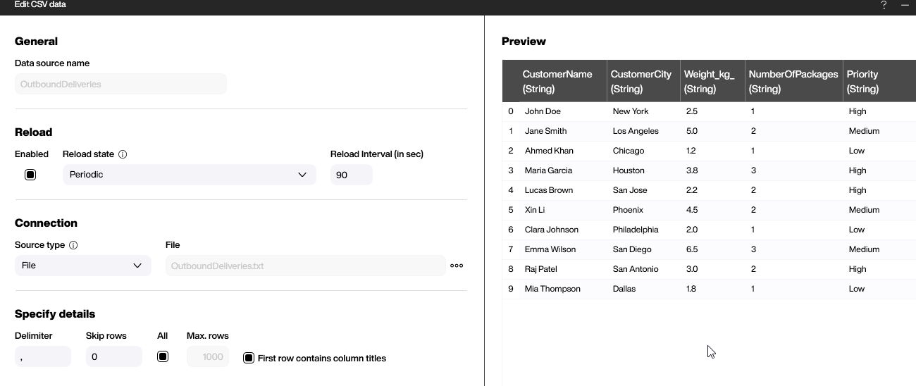
This example is based on a simple CSV data file. It’s included in the project file, and it shows a couple of outbound deliveries, including the recipient’s name, weight of the delivery, priority etc.
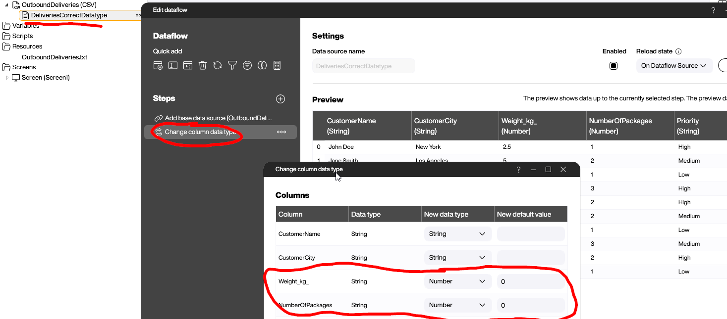
To make it easier to handle the data later, we add a dataflow to the data source. As you can see in the screenshot, we change the data type for the Weight and NumberOfPackages columns to Number. We have to do this manually, because every column of a CSV file is treated as a string by default.
Setting up the table control
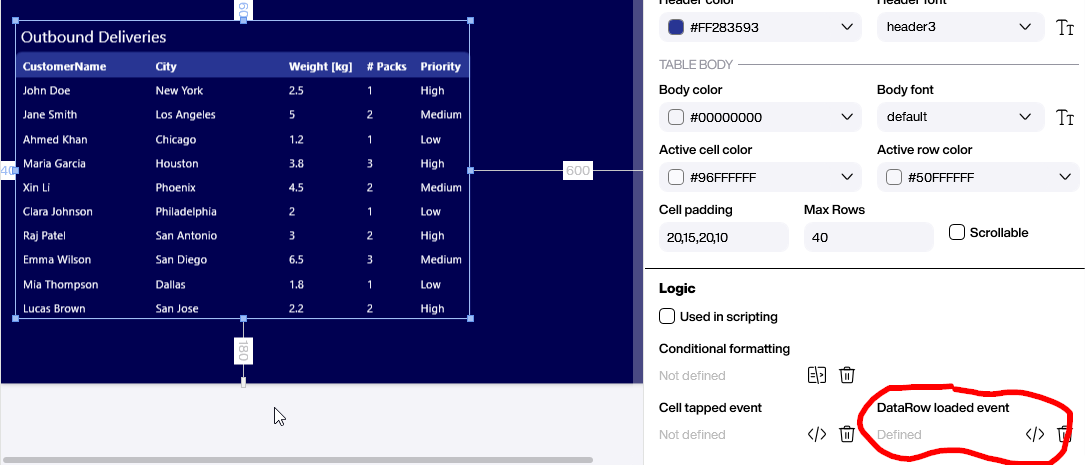
To add our table control, we drag and drop the data flow onto the canvas, and then choose a table control. To make it look a bit nicer, we adjust the column labels, column width, and title of the control.
The most important part is the Datarow loaded event. It’s triggered every time a row is painted onto the canvas during runtime. Let’s assume our dataset has 10 rows. Then, the event is fired 10 times, once for each data row.
All the manipulation can be done within this event. The manipulation can change attributes like the cell color or even to the data values that are displayed. Let’s learn more about these manipulations.
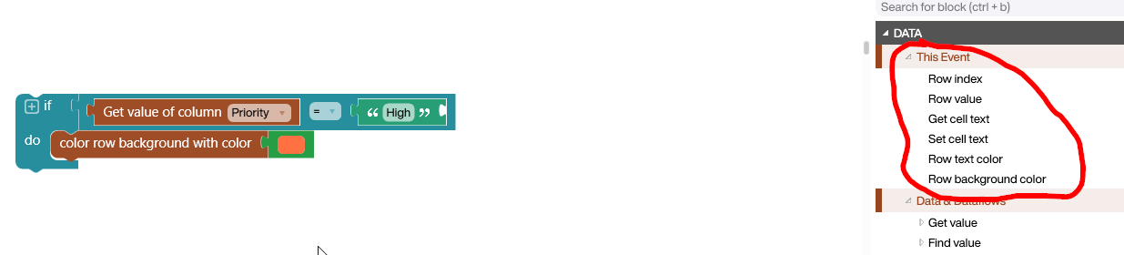
Within the event editor, there are several blocks we can use for the Datarow loaded event. Let’s assume we want to know the content of the Priority column of the data row that is currently being painted. Then, we just use the block Row value.
This script shows how you can get the value of a column and use it in an if statement. It checks if the priority of the delivery is high, and if so, it changes the background color to red.
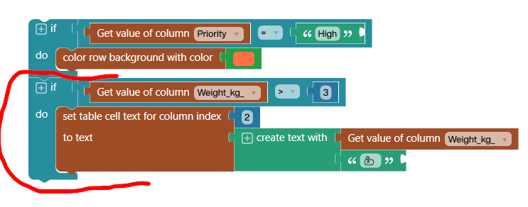
This script shows how you can manipulate the data that’s displayed in a cell. In this case, we check if the weight column content is greater than 3 kg. If so, we add a Unicode character representing the flexed biceps muscle: 💪.
In Peakboard, these Unicode characters are always monochrome. Please note: We are manipulating the contents of the cell in the table, and not the actual data. That’s why we use the Set table cell block to paint our adjusted content.
Here’s the final result, which shows the red priority rows and the muscle icon:
Conclusion
This article shows how easy it is to manipulate the output of a table control with just a few clicks. But sometimes, more complex adjustments are needed, and the table control may not provide the capabilities to do so. In this case, it is better to use a “Styled list” control in which you define the design of a sample row and add rules that are then applied to each row.