
Machines are talkative these days. Whether we collect their signals over OPC UA, subscribe to an MQTT topic, or let a PLC write into a database table, the result usually looks the same: a long list of events, each with a timestamp, the machine it came from, and a few attributes describing what happened. “CNC Mill 02 went to Running at 08:05.” “Press 01 reported Breakdown at 08:40.”
That list answers the question “what happened?” perfectly well. The trouble is that this is not the question anybody on the shop floor is asking. They ask “how long?”. How long was the press down this morning, how much of the shift did the robot cell spend waiting for material, and is the mill running more today than yesterday. And that is precisely the information the event list does not contain, because the duration of an event is never stored anywhere. It only exists as the gap between one event and the next one from the same machine.
Closing that gap used to be a scripting exercise. Since Peakboard 4.4 there is a dataflow step that does it for us, and this article is about that step.
The Starting Point: a Plain Event Log
Our sample application fakes what a data source would normally deliver. LIST_MachineEvents holds three columns and nothing else: a timestamp, a machine name, and an event name. Three machines report into the same list, and the rows are in chronological order, which means the events of the individual machines are interleaved.
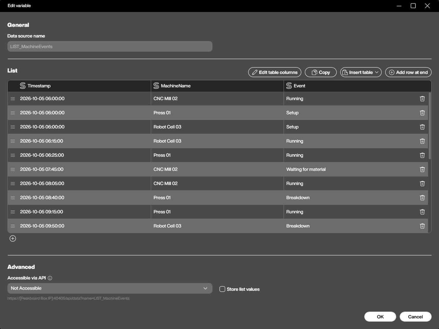
This is the shape that an OPC UA subscription or an MQTT topic typically produces, and it is worth looking at closely for a moment. Row three says Robot Cell 03 went into Setup at 06:00. The next Robot Cell 03 row, two rows further down, says Running at 06:15. So the setup took fifteen minutes. The information is in there, but it is spread across two rows that are not even adjacent.
The Duration Step
The Duration step turns exactly that reasoning into a configuration dialog. We add it to a dataflow, point it at the timestamp column, and it writes a new column holding the number of seconds from each row to the following one.
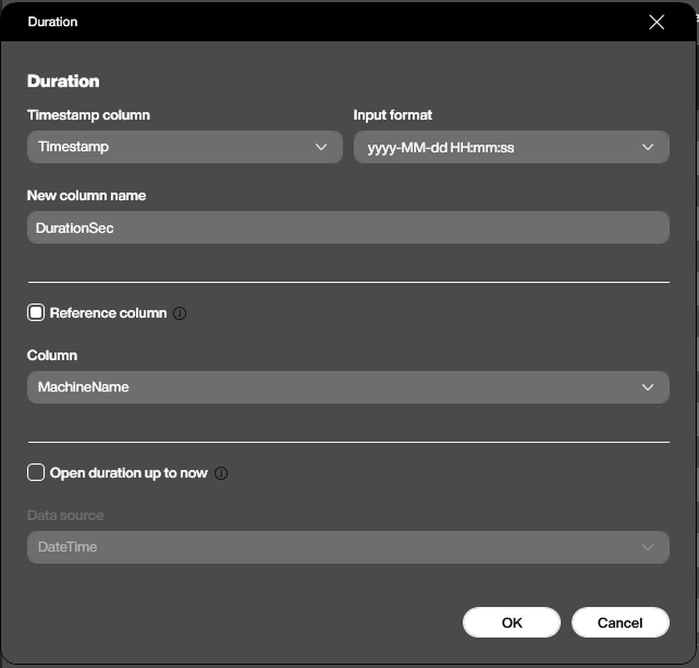
Four settings matter, and the third one is the one that makes the step useful in the real world.
Timestamp column and Input format tell the step where the time lives and how to read it. Our list stores the timestamp as a string in the format yyyy-MM-dd HH:mm:ss, so that is what we select. If the column is already a proper date type, the format can stay on automatic recognition.
New column name is the name of the column that gets added. We call it DurationSec, because seconds is what the step delivers. A quarter of an hour arrives as 900, not as 0:15.
Reference column is the important one. Without it, the step treats the whole table as a single sequence and measures the time from each row to the next row, regardless of which machine that row belongs to. In our interleaved list that would produce complete nonsense: the gap between a CNC Mill event and the Press event that happens to follow it. With the reference column set to MachineName, the step measures separately within each group of rows that share the same value, so each machine is timed against its own next event. The tooltip puts it plainly: “Measure the duration separately within each group of rows that share the same value in this column - e.g. per machine.”
Open duration up to now deals with the last row of every group, which has no successor and therefore no duration. Switched on, the step measures that final row against a time data source instead, so a state that is still running right now keeps growing on the dashboard. Our sample leaves it off and closes the shift with an explicit “Shift end” row instead, which is the other common pattern.
One rule is easy to overlook: the step always measures from one row to the next as the rows currently are, so the input has to be sorted by timestamp before the step runs. If it is not, the Designer warns us and suggests adding a sort step first.
The Result
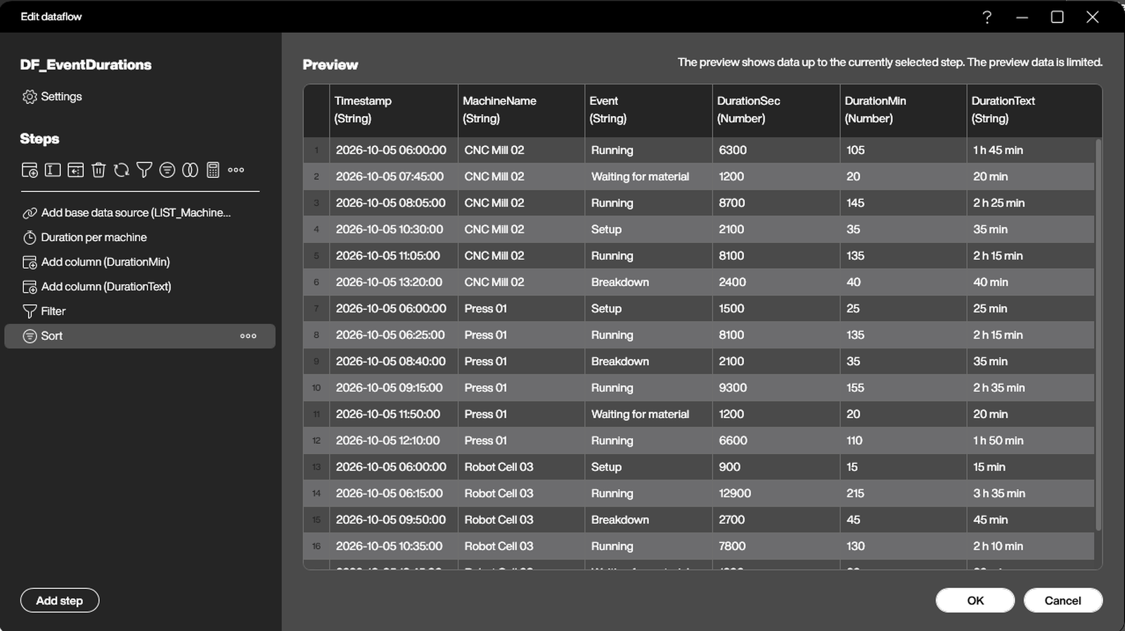
With the step in place, the dataflow carries a DurationSec column, and every row now states how long that state lasted. The rest of the dataflow is ordinary housekeeping: two calculated columns turn the seconds into minutes and into a readable “2 h 25 min” text, a filter drops the technical “Shift end” rows, and a sort brings the machines back together for display.
From there it is a short hop to the things people actually want to see. A second dataflow, DF_DurationByMachine, groups the rows by machine and event and sums the minutes, which is all a stacked bar chart needs to show how the shift was spent.
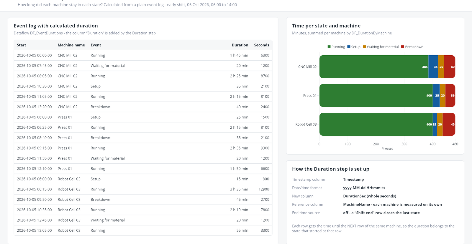
The formatting helpers, the chart configuration and the aggregation are all in the sample application at the top of this article, and they are worth a look if that part is new. But none of it is the interesting bit. The interesting bit is that the step above replaced what used to be a nested loop in Lua, comparing each row against the next one of the same machine and hoping the sort order holds.
Where This Pays Off
Once durations are a column rather than a calculation, a whole category of shop floor questions becomes a normal chart. Downtime per machine and per shift. The share of a shift spent waiting for material. How long a part sits between two stations. The average setup time per machine, which is the number that tells us whether a SMED workshop actually changed anything.
All of it comes from the same humble event list the machines were sending anyway. We just had to mind the gap.