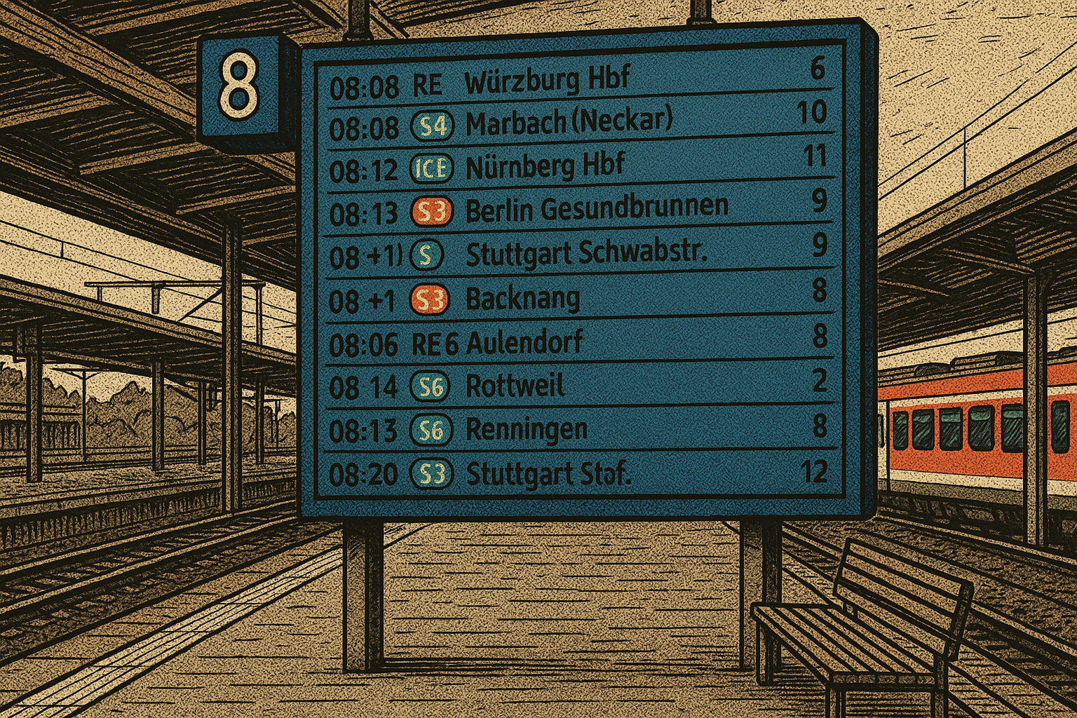
On this blog, we’ve introduced many different APIs and explained how to use them in Peakboard. Today, we’ll be looking at the DBF API. This is an unofficial API that returns the arrival and departure times of trains in Germany. The API’s backend is open source, and you can learn more about it by checking out the GitHub repo.
We’ll use this API to build an app that shows all the train departures of a German city, just like a departure board in a train station. The greater goal of this article is to explain how to process an API payload and display a formatted version of the data, using dataflows and conditional formatting.
The API call
The API endpoint looks like this:
https://dbf.finalrewind.org/<xxx>.json
We replace <xxx> with the station name. To get the right station name, we use the search tool on the DBF website:
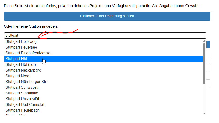
If the station name contains a space, we replace the space with %20, in our endpoint. So the endpoint for the Stuttgart main station, “Stuttgart Hbf,” looks like this:
https://dbf.finalrewind.org/Stuttgart%20Hbf.json
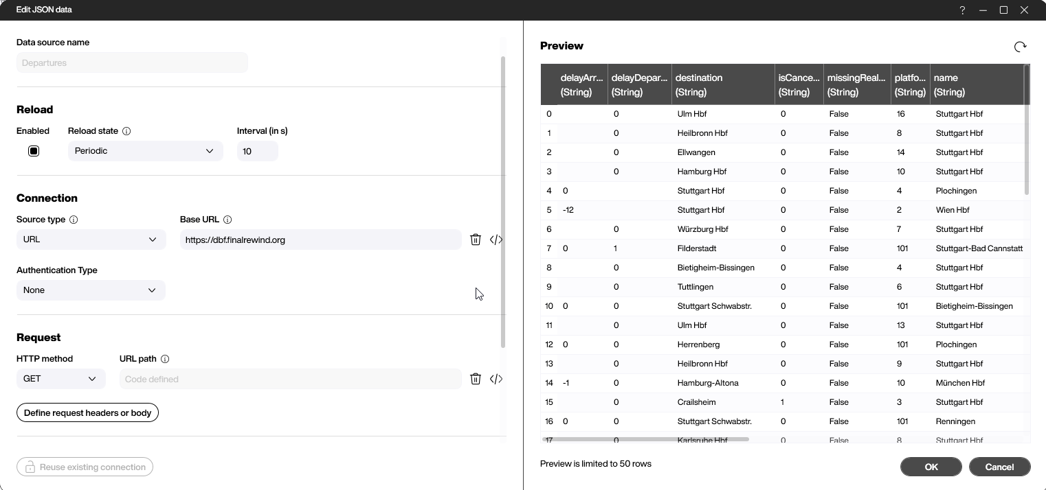
In Peakboard, we create a new JSON data source for our endpoint. We set the station name dynamically, with a variable:
Process the data
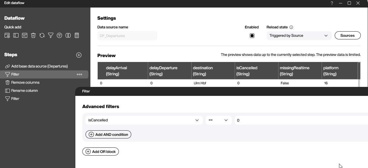
To process the data from the API, we use a dataflow. First, we filter out all cancelled trains, by checking if the isCancelled column is equal to 0:
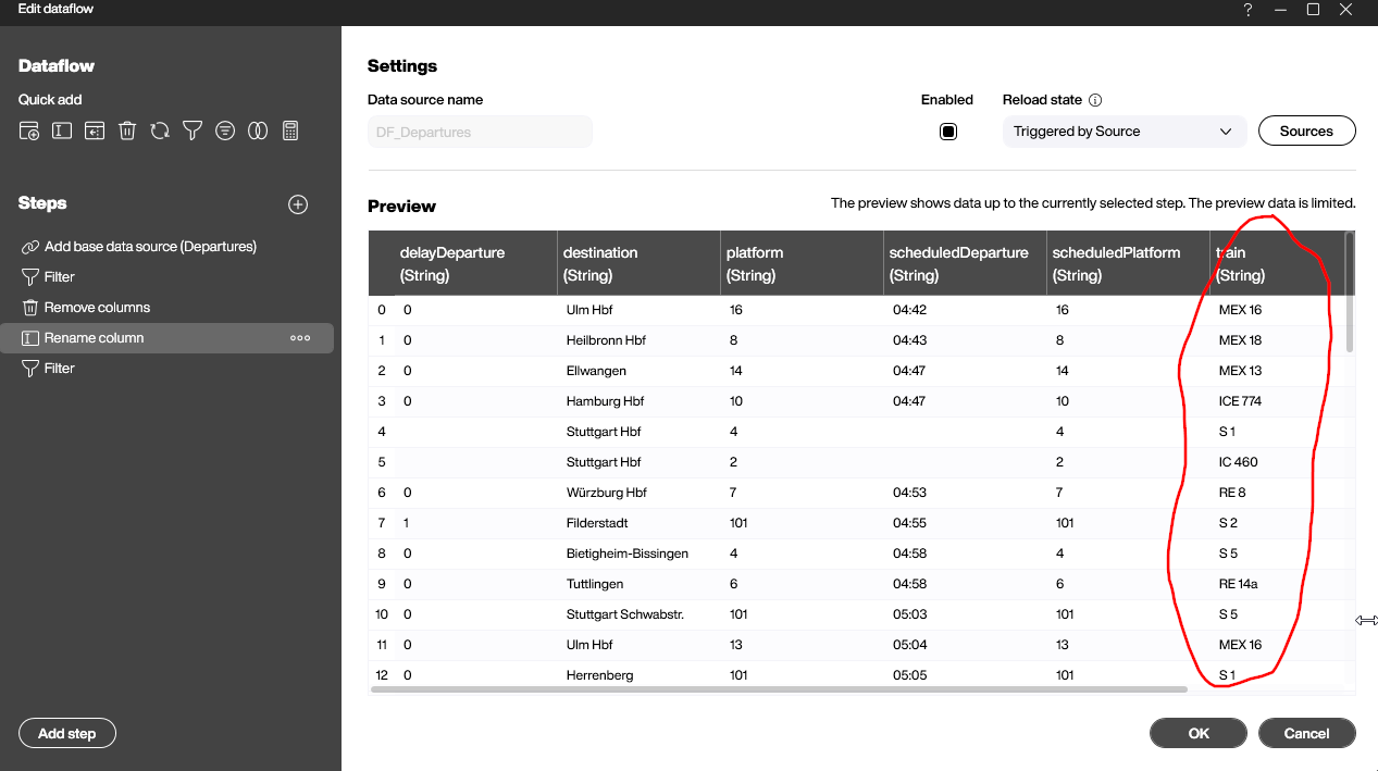
Then, we remove all the columns that we don’t need. We also rename the last column from “Unknown” to “train,” because it contains the names of the trains.
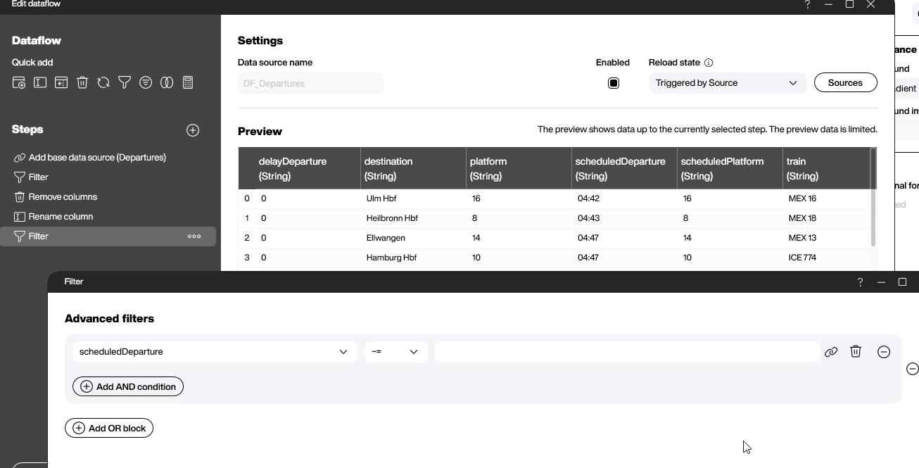
Finally, we filter out all the trains that don’t have a scheduled departure time. We do this by checking if the scheduleDeparture column is not the empty string.
Build the display
To create the actual display, we use a styled list with some text boxes and images. For more details, download the PBMX.
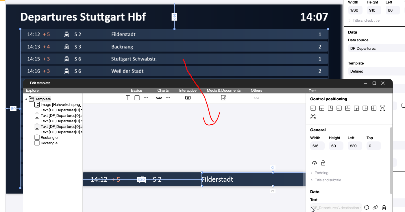
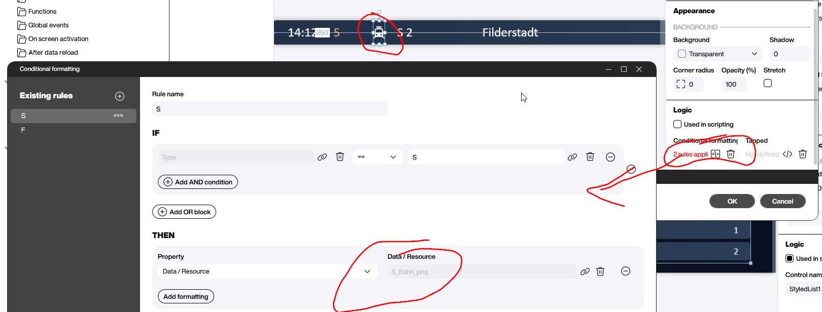
Most of the logic is done through conditional formatting. This screenshot shows how we use a different icon for long distance and local trains:
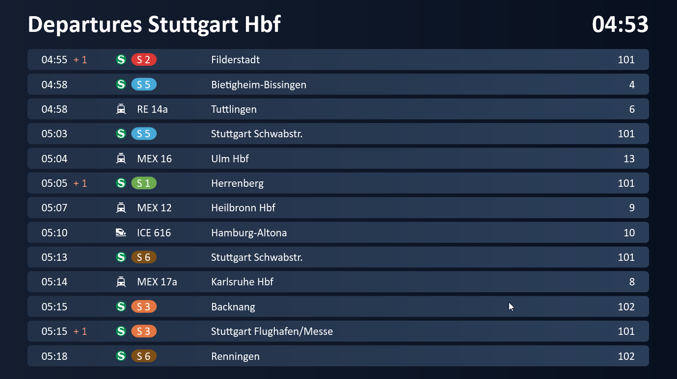
Result
The following screenshot shows the final result, with all the different colors and other functions for visualizing the information. It’s a great example of how you can format your data without writing a single line of code!